
CAPTIVATED: unlocking what makes people tick, click, and buy, with psychology-backed, consumer behavior growth tips to 10X sales in 10 minutes
Today’s Edition of Captivated: Why Your Customers Bail at Checkout (and How to Fix It) - [A FREE MINI MASTERCLASS]
This special edition is a free mini-masterclass for our most engaged subscribers: thank you!
“Congratulations!”
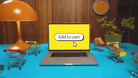
You did all the hard work. The click, the cart, the convince.
They wanted it. They added it.
Then...Poof, they disappear at checkout without buying anything.
But why?
It’s not always the price. It’s not always the product.
It’s the psychology of the final step, and most checkouts are accidentally creating the perfect storm for drop-off...
(continues below).
🧠 SMART TOOLS YOU CAN USE: SUPPORT OUR SPONSORS
Need IT help, like yesterday?

Struggling to find qualified tech talent? Crossbridge connects you with qualified candidates from Latin America in just 24 hours. Our human-led process guarantees we’ll match you with the right people for your team.
🎧 Rather Listen than Read?
Scroll all the way to the top and click: Listen Online
🧭 INSIDE THIS EDITION
📈 DID YOU KNOW?
A staggering 70% of online shopping carts are abandoned, and more than 18% of those are due to a too long or complicated checkout process.
🤔
.. What’s the Big Deal? ..
Checkout is where sales go to die, if not handled properly. It’s where your buyer’s brain goes from dreaming to deciding.
And that shift triggers doubt, risk aversion, and friction.
You’ve moved them out of inspiration and into logistics. Ugh.
And unless you handle it with care, their brain pulls the emergency brake.
Most checkouts make it worse with confusing layouts, extra steps, and micro-mistrust signals like promo codes that can feel like punishment for not having one.
🧠
.. Brain Science-Backed: The Psychology Behind It ..
1. 🧠 LOSS AVERSION:
Spending money feels like losing something.
People feel losses twice as intensely as gains. Unless the value is reframed as a gain, the brain clings to the safety of not spending.
This is why we’ll drive across town to save $20, even if it costs us $10 in gas.
So it's also why we hesitate before clicking “buy now” even when we really want the thing.
2. 🧠 DECISION FATIGUE:
By checkout, they’ve made dozens of micro-decisions. One more feels exhausting.
When the brain is tired, it defaults to inaction (aka abandoning the cart).
This is why we’ll scroll Netflix forever and then just go to bed without watching anything.
And its also why we’ll stare at a cart for 10 minutes and then just… close the tab.
3. 🧠 FRICTION BIAS:
Any delay or extra field adds cognitive load. The brain looks for excuses to opt out.
Even small moments of confusion or effort feel bigger when someone’s already mentally fatigued.
This is why we groan when we see "Create an account" pop up out of nowhere.
And it’s why we abandon forms halfway through if they start asking for info we don’t have on hand.
4. 🧠 TRUST SIGNALS:
The brain scans for anything off: slow load time, weird layout, or unclear return policy = red flag. If it doesn’t feel safe or familiar, the brain chooses the safer route: exit.
This is why we second-guess unfamiliar apps that ask for our credit card upfront.
And it’s why even a tiny typo or sketchy logo can tank conversion.
5. 🧠 CHOICE OVERLOAD:
Too many shipping/payment options = overwhelmed brain = exit tab.
Simplicity feels like relief; complexity feels like risk and effort.
This is why we freeze up at Cheesecake Factory menus or just ask the waiter, "What do people usually get?"
And it’s also why we’ll happily go with the “standard shipping” button, even if it’s slower.
🤩
.. What to Do? ..
Think of checkout like the final stretch of a race. Don’t put hurdles in the way, make it feel like a smooth glide to the finish line.
Here’s how to tighten it up:
Cut the clutter: Only include essential fields and group related info (like billing + shipping)
Speed it up: Offer express options like Shop Pay, Apple Pay, or saved details for return users
Make it calm: Keep design and copy clean, confident, and consistent with your brand tone
Reassure along the way: Add subtle reinforcements like "Secure Checkout" or a quick note on returns/refunds
These seem small, but together, they flip the script in your customer’s brain from hesitate to complete.
🔍
.. In the Wild: Brain-Smart Brands Getting It Right..
Nike:
Nike’s checkout experience is designed for clarity and speed. On mobile, it’s especially smooth: big buttons, minimal steps, and not much to think about. That simplicity reduces cognitive load and decision fatigue, keeping things moving even when a customer’s brain is low on energy.
Etsy:
Etsy prominently features a “Continue as Guest” option right at the top of the account-selection overlay during checkout. It’s a small detail, but this kind of clear labeling and placement reduces friction in a big way, especially for first-time buyers who just want to get in and out.
Each of these small choices helps reduce doubt, effort, and delay, exactly what matters most in that final moment.
🥷
.. Steal this Strategy for Yourself ..
MINI CAPTIVATED CHECKLIST FOR YOUR CHECKOUT:
Whether you sell a $27 ebook or $2,700 software, these tactics can help lower drop-off and increase conversions immediately:
1 - SHRINK THE STEPS:
Every added field is a mini decision, and too many trigger decision fatigue and choice overload.
Auto-fill addresses if possible
Offer guest checkout
Combine billing + shipping if same
Show progress bar (yes, even for short checkouts!)
2 - REDUCE THE MENTAL LOAD:
Clear, simple layouts reduce friction bias and help the brain conserve energy.
Fewer fields
Pre-select most common shipping option
Use calm, confident copy: don’t make this page louder than the others
Avoid surprise fees at the end
3 - INCREASE TRUST SIGNALS:
The brain is on high alert here. Address trust checks proactively.
Add trust badges, security seals, and testimonials
Display return/refund info visibly
Highlight support availability (chat, phone, etc.)
4 - MAKE IT FEEL LIKE A WIN:
Frame the purchase as gain, not loss. This counters loss aversion.
Show what they’re getting: photo + benefits recap
Frame purchase as a smart decision (“You saved 20% with this bundle”)
Consider adding a small, no-brainer upsell with a single click (“Add this $3 bonus guide?”)
✌
.. tl;dr & captivated wrap-up ..
Your checkout is the make-or-break moment in your sales funnel, the one where emotion, hesitation, and friction peak. This step is affected by how the brain feels, not just what the brain thinks.
✅ Make it fast
✅ Make it clear
✅ Make it feel safe
✅ Make it feel good
Do this, and you help people take that last crucial step with clarity and confidence. Getting to checkout shows they already wanted the product. Don’t let the process get in the way of the purchase.
🧠 SMART TOOLS YOU CAN USE: SUPPORT OUR SPONSORS
Grow smarter: Reallocate ad spend, boost ROAS with affiliates

Ad spend keeps climbing. ROAS? Not so much.
The smartest Amazon sellers aren’t spending more—they’re spending smarter.
The Affiliate Shift Calculator models what could happen if you reallocated a portion of your ad budget into affiliate marketing.
Built for sellers doing $5M+ on Amazon.
I hope you found this free mini-masterclass valuable. You can save it and use it as a checklist for your checkout.
You are appreciated.
Stay great, captivate, and grow smarter!
👋 Until next time,
Profit Nic